Imaging Matters rebrand project

Imaging Matters,  since 2016 have been providing amazing opportunities based on the desire to improve patient access to life-saving diagnostic tools and optimise experiences for all users.  

In 2022, Webvid Creative was commissioned to update their brand aesthetics to be more inline with their already strong values and messaging.  

Brand Identity

Imaging matter logo

The logo

The vision

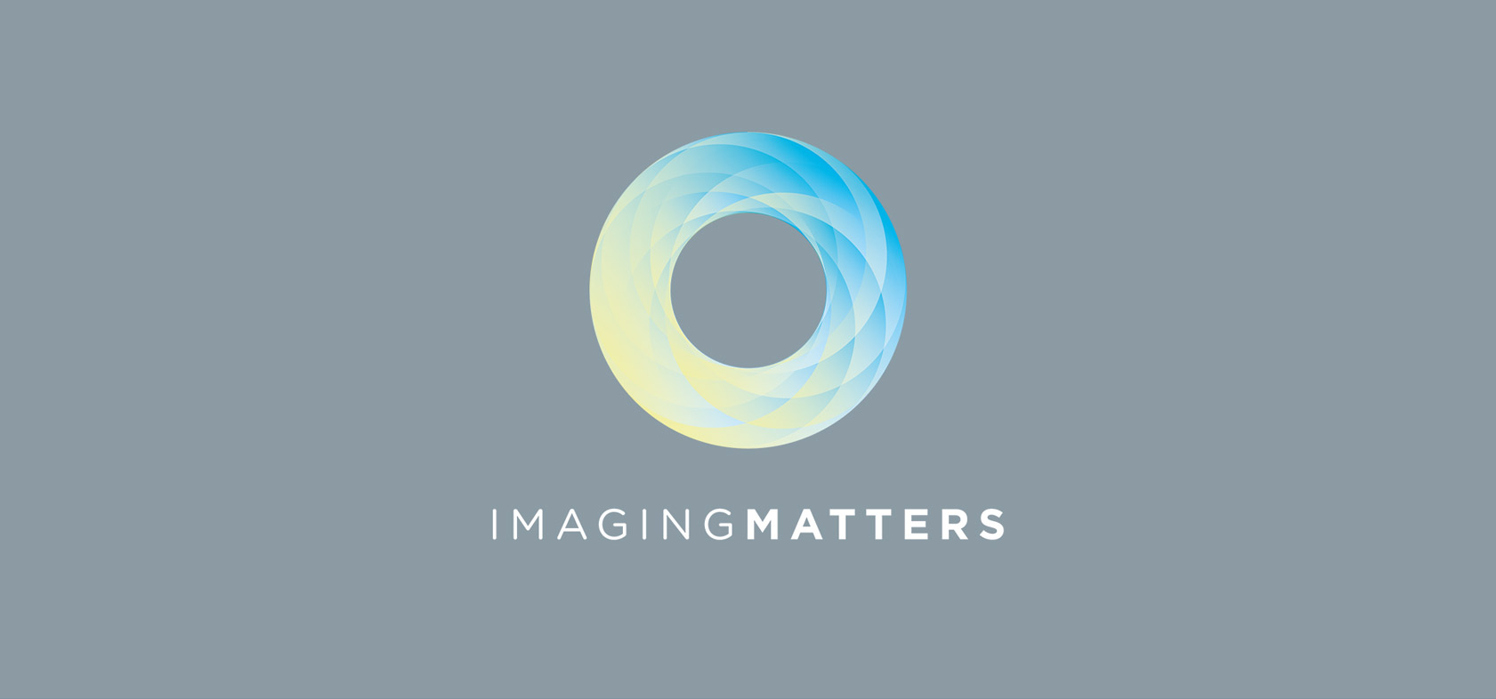
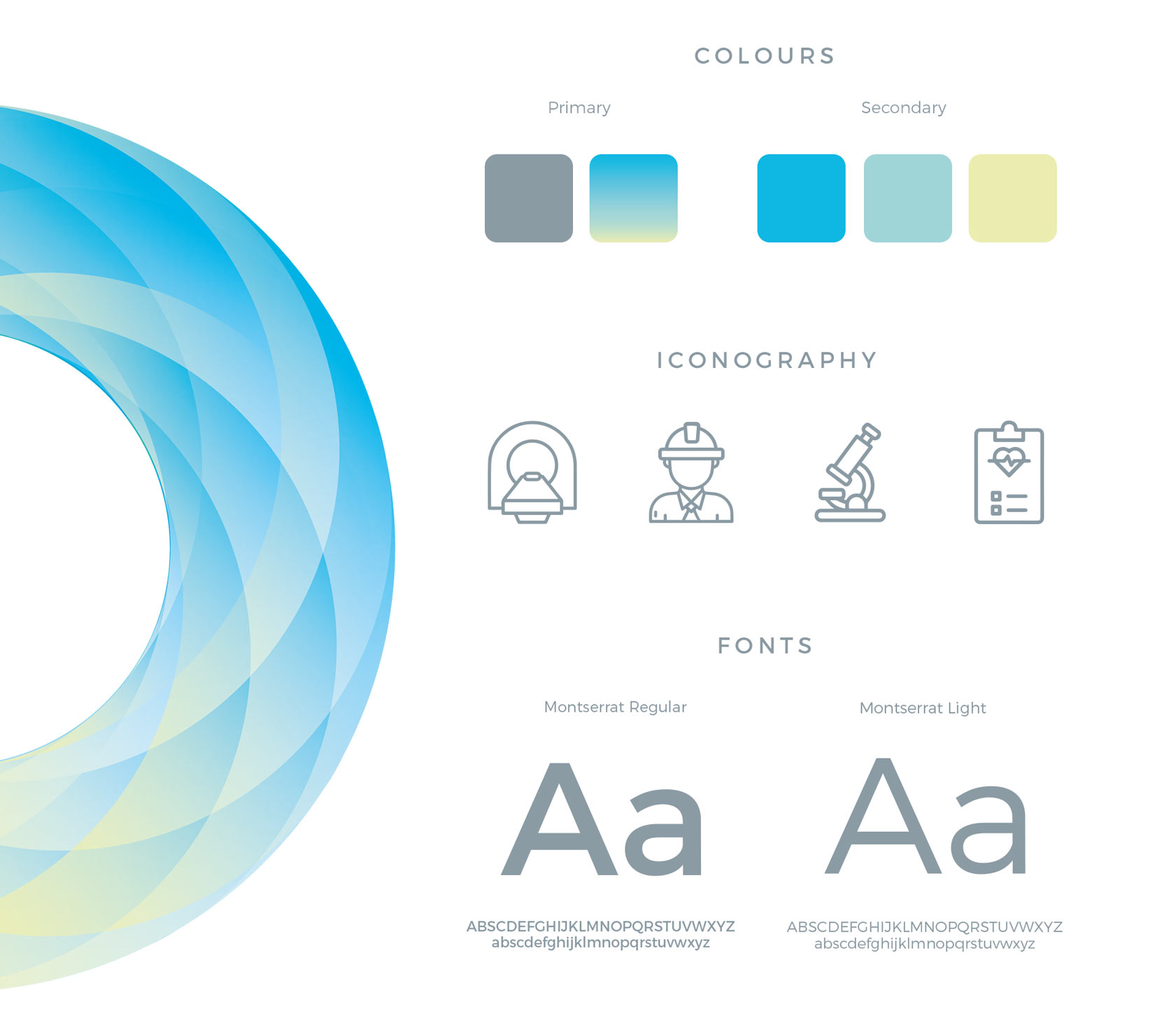
The geometry in the ring was inspired by Imaging Matters vision. To bring continual improvement for patient access to life saving diagnostic tools and centres. 

We chose the colours we most associated with calmness and life, to reflect their responsibility and ingenuity in these areas, and finished with the simplistic style and breathable spacing of the name, to complete and not distract from the ring of the logo. Encompassing their core goals and values in one space.

The asset breakdown

Imaging matters brand assets
Imaging matters business card and messaging

Taking assets into the design space

Imaging matters - rebrand items
We are really happy with the outcome and your support. We are blown away by the logo!
‐ Leigh Melvin
imaging matters - footer logo